Buoy Assistant is an AI symptom checker, built with doctors, that asks the right questions and guides people toward the care they actually need.
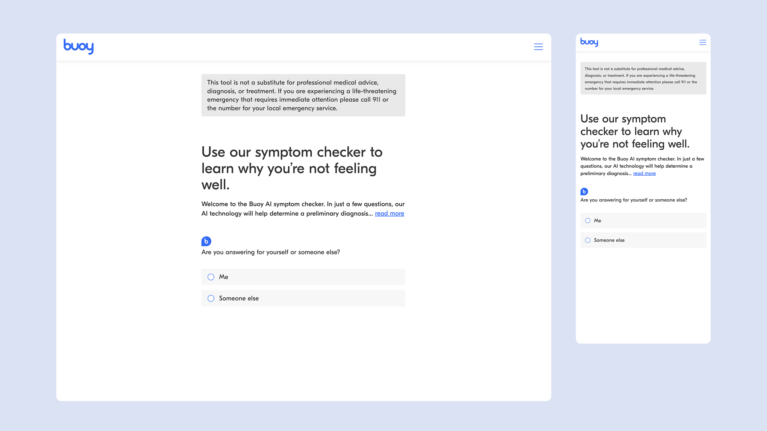
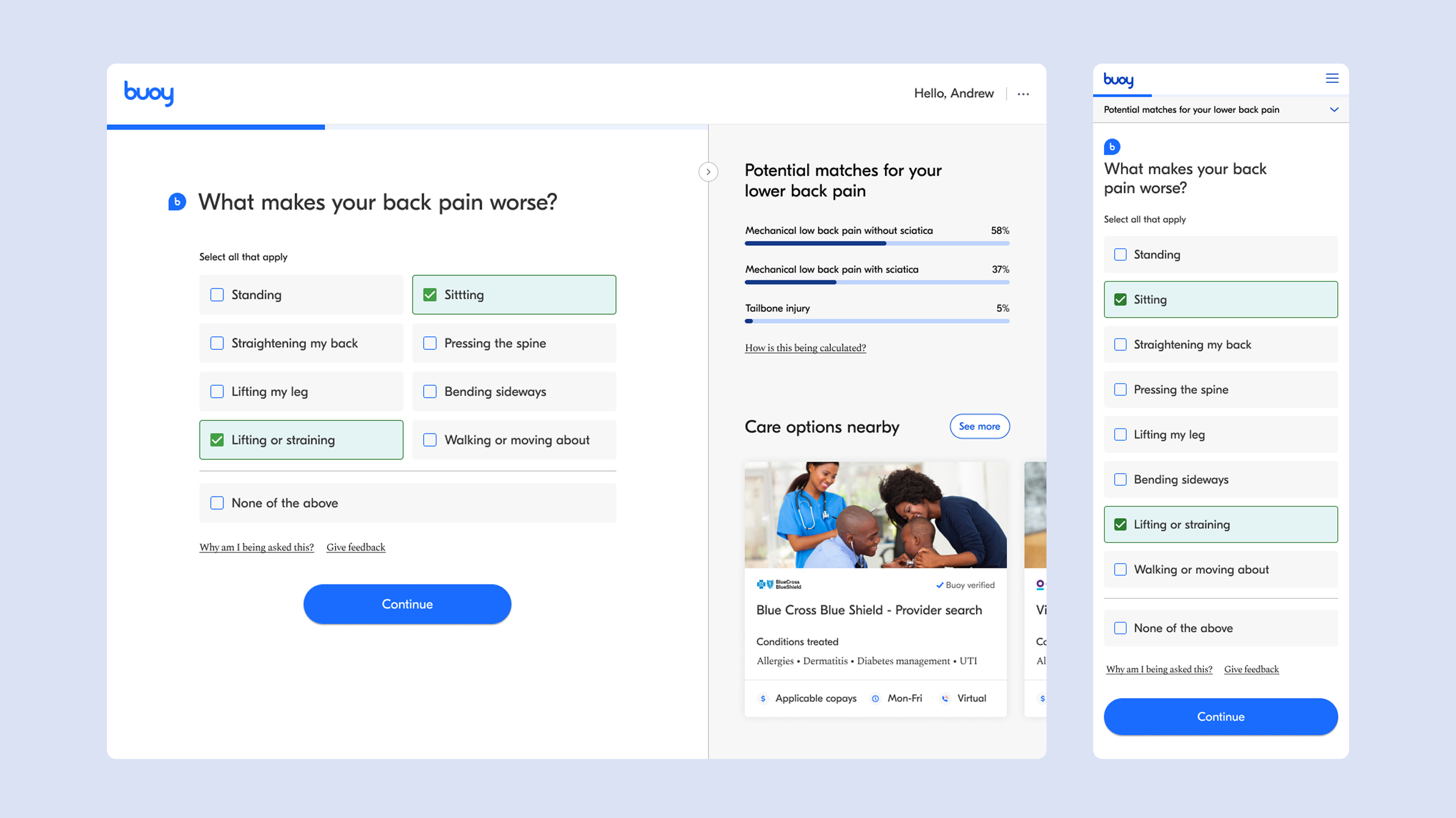
For anyone with a nagging symptom and no clear sense of what to do next, Buoy asks a few questions the way a clinician would, then explains the possible causes and points toward the right level of care, whether that's rest, a doctor's visit, or the ER.
As a senior designer on the product, I focused on the front door: the moment someone first arrives and decides how to begin. That meant rethinking the entry experience and making it work for a clinically and demographically diverse audience.
The problem
The original Buoy Assistant started everyone the same way: a single entry point into a fixed, linear Q&A, with no way to skip ahead or begin differently. But people arrive very differently. Some are anxious and unsure where to start; others already know their symptom and just want to move.
Key considerations
- The flow had to work across very different levels of health literacy and urgency
- Some people want to describe symptoms in their own words; others need more guidance
- The experience needed to feel approachable and personal, not clinical
Design approach
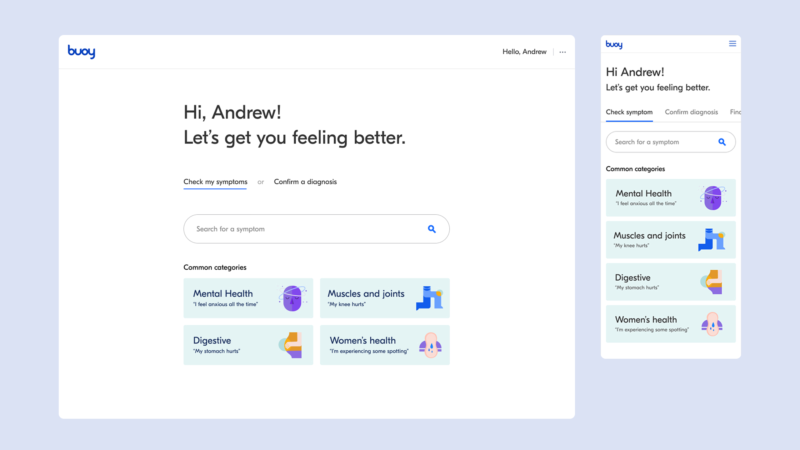
I gave people multiple ways in: search a symptom directly, browse common categories, or confirm a diagnosis they already suspect. Each path leads into the same guided interview, so the experience meets people where they are without fragmenting underneath.
Summer