Eden is a golf course discovery app that helps golfers find courses they never knew existed, from hidden local gems to destination rounds worth traveling for.
Eden had strong early traction, but its identity felt generic and AI-generated, and the core screens carried friction that got in the way.
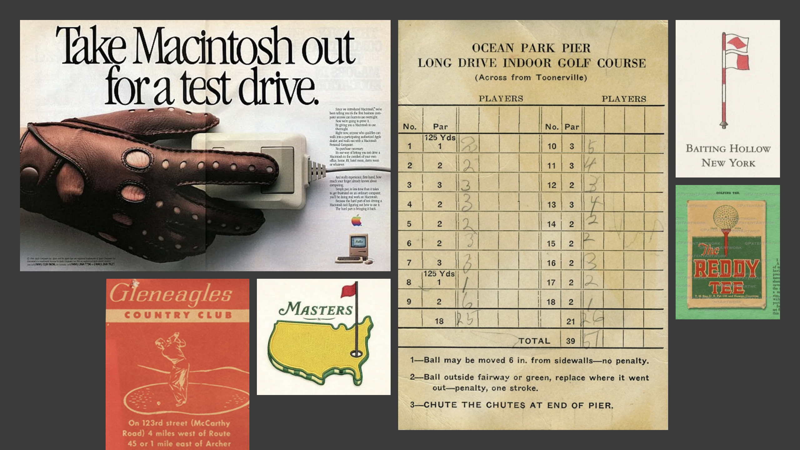
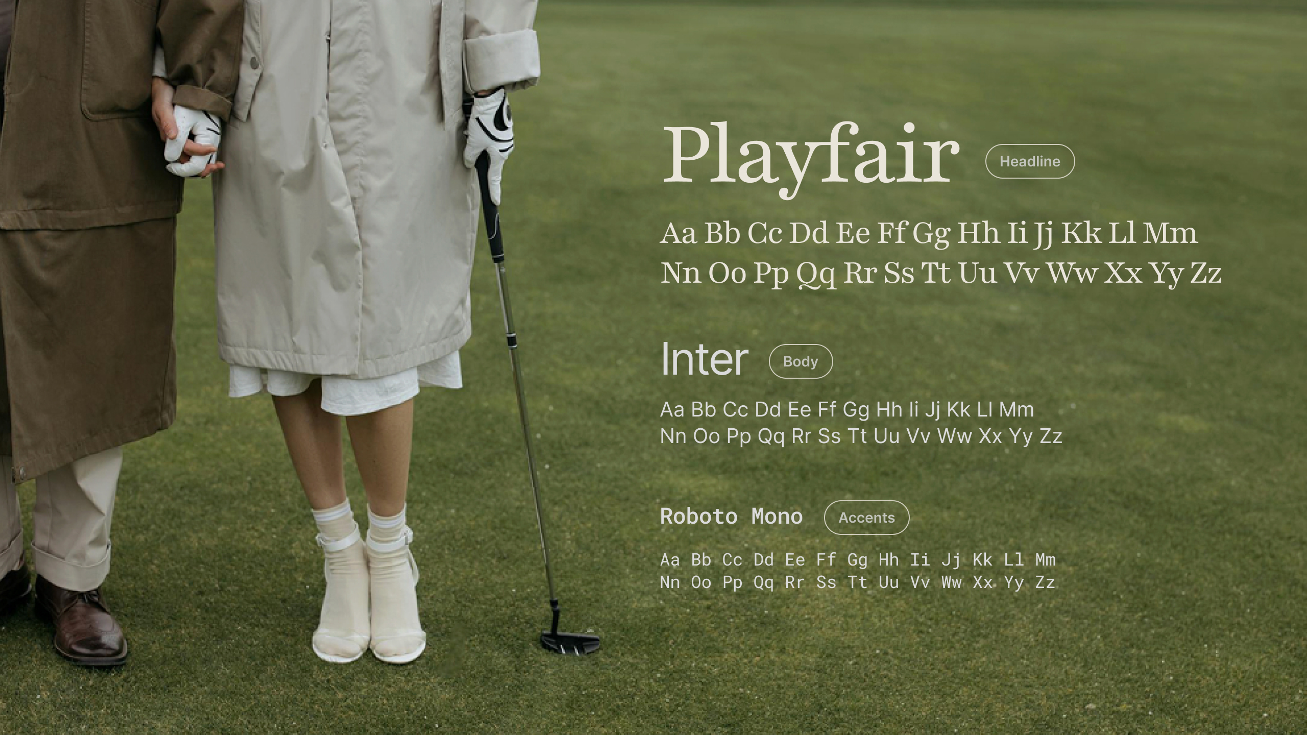
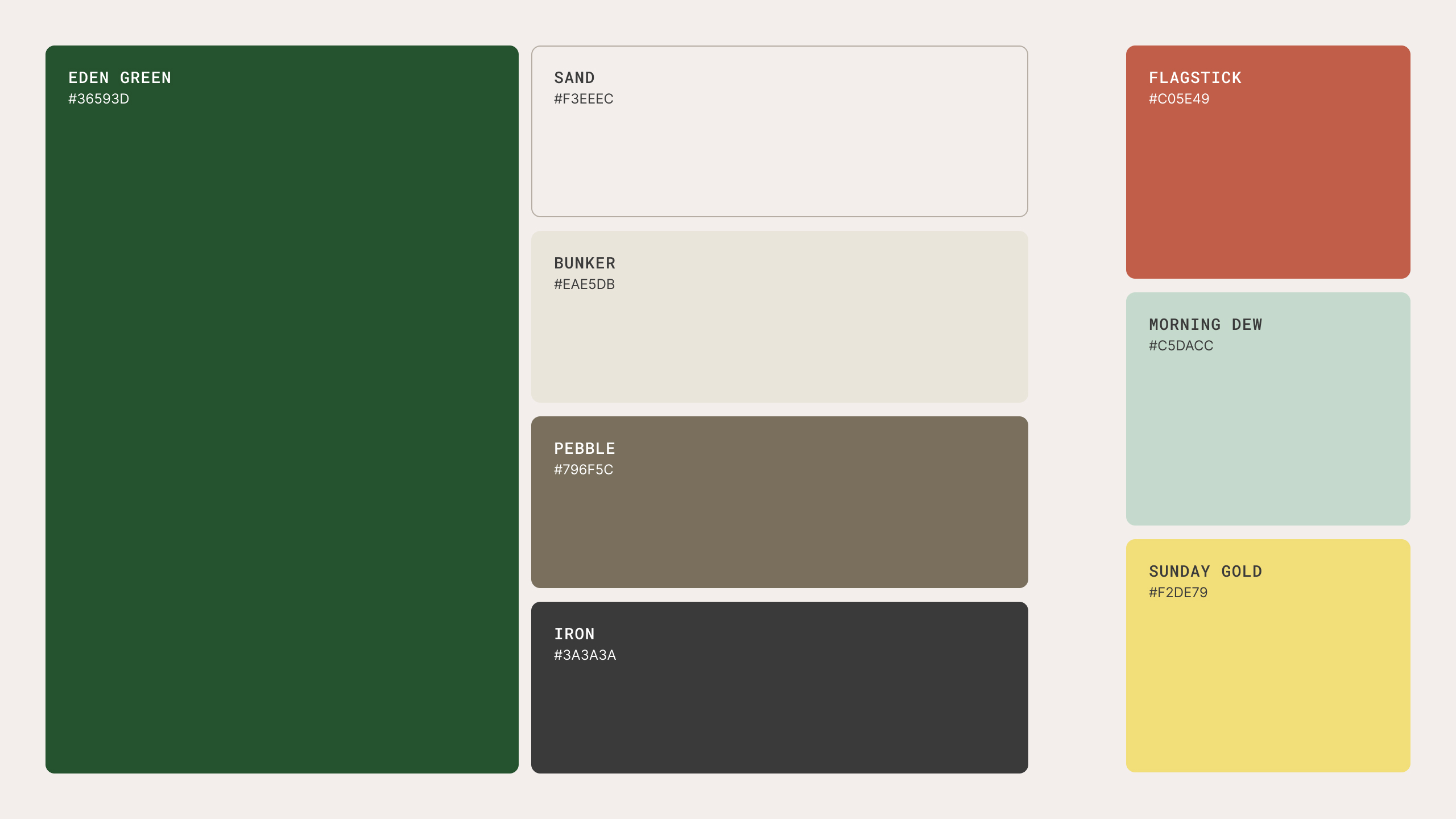
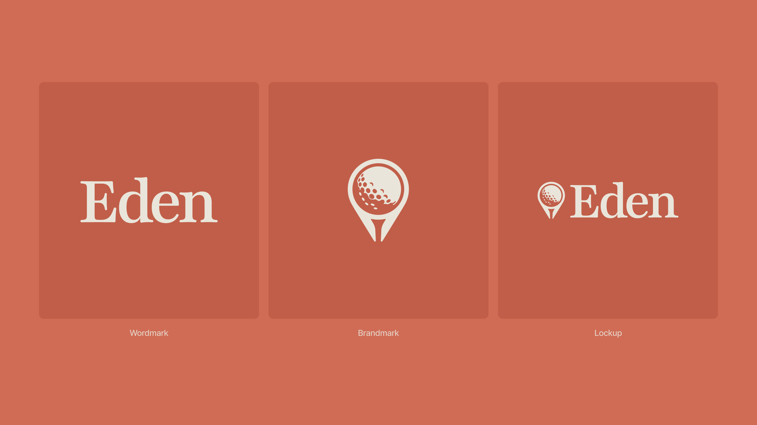
So I rebuilt the identity around the timeless, understated heritage of the sport itself, aiming for something premium and unmistakably Eden. Then I carried the new system through the core screens, smoothing out the flows that had been creating friction.
The app redesign
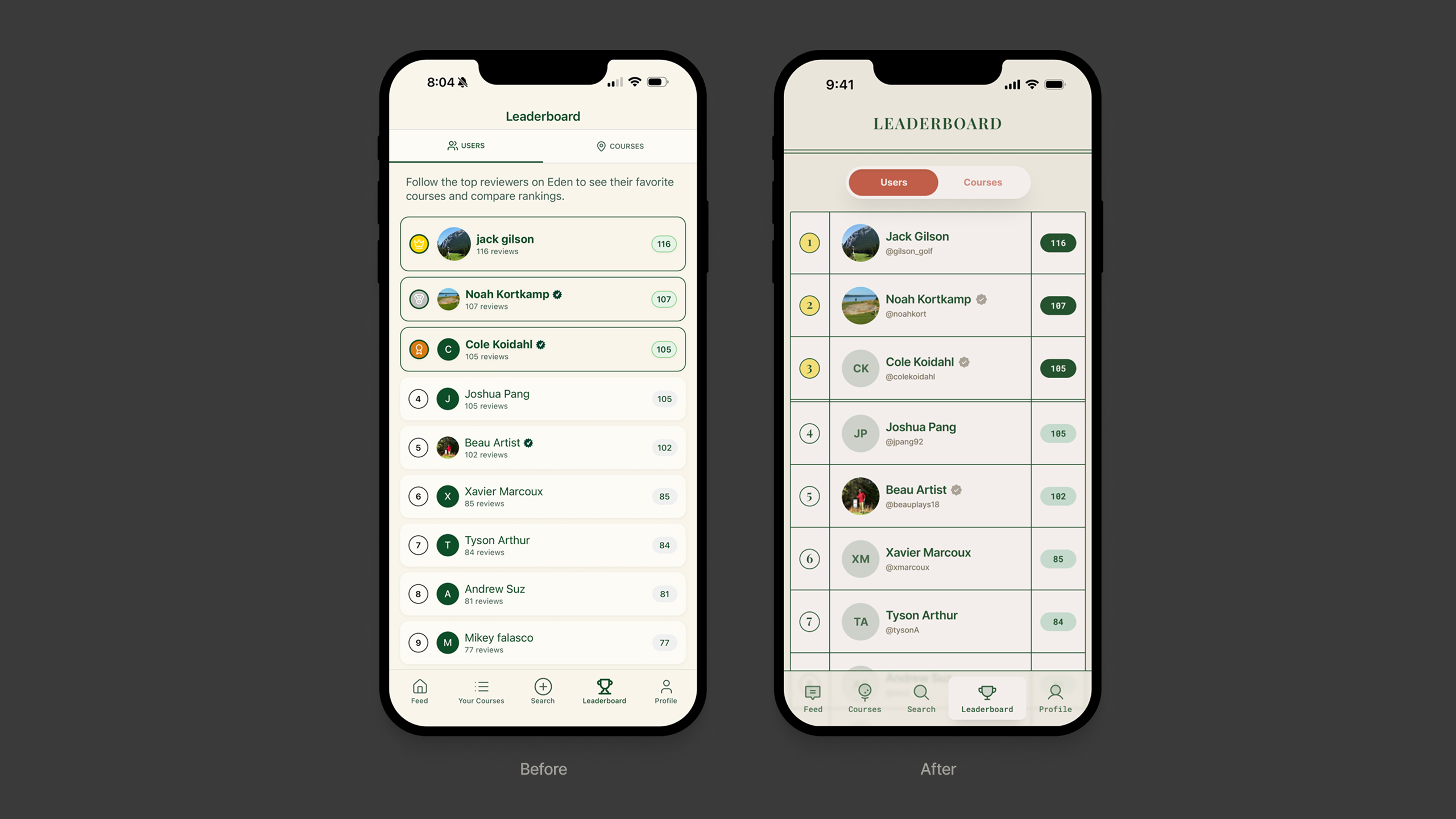
With the new identity in place, I reworked Eden's core screens. The scorecard's ruled lines run through the layout, tying the interface back to the brand, while I smoothed out the flows that had been creating friction.
What changed
- Removed the unnecessary description copy up top
- Rebuilt the Users/Courses toggle as a pill component in the brand red, reused globally across tabs
- Swapped the redundant review count under each username for the user's Eden handle
What changed
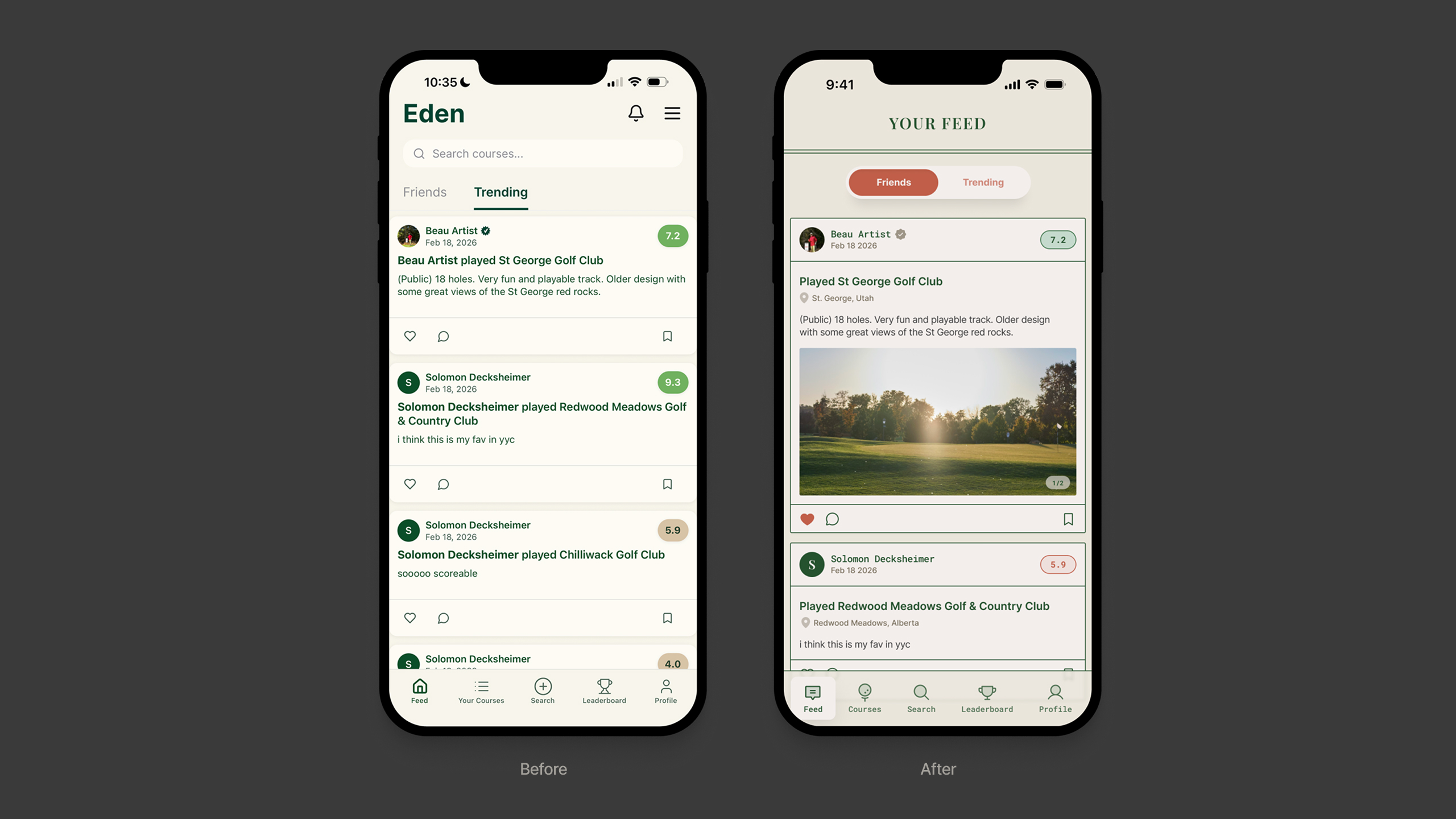
- Carried the leaderboard's brand updates through here (pill toggle, scorecard lines, tab bar)
- Dropped the header and search bar, since search has its own tab
- Cut the repeated username from post titles (“Beau Artist played…” became “Played…”)
- Added the course location under its name for quick context
- Introduced course photos with an image counter, making posts more visual
What changed
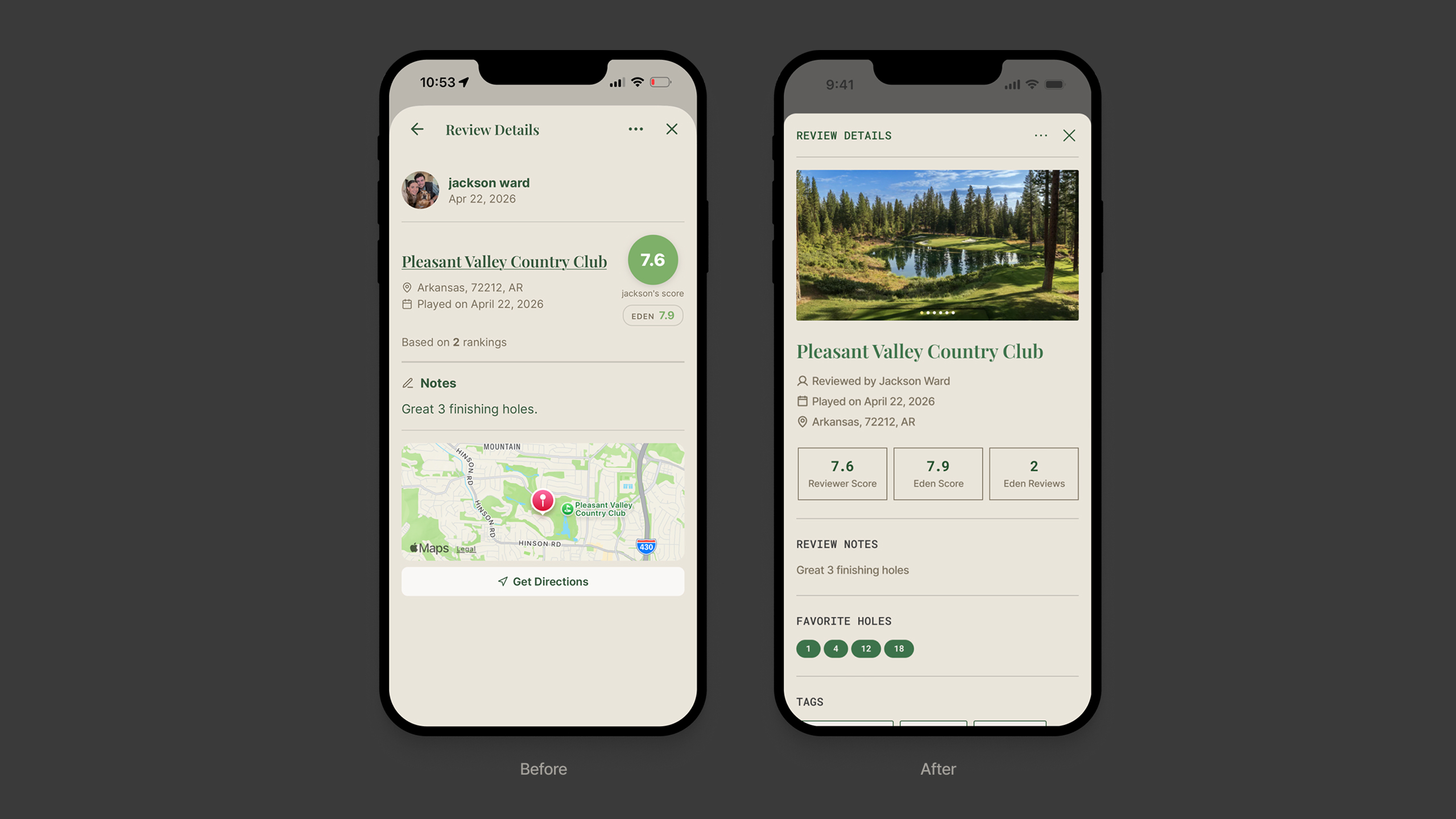
- Standardized the bottom-sheet header app-wide, replacing a mix of back arrows, close buttons, and type treatments
- Added a hero photo carousel when a review includes photos
- Restructured scattered score labels into a clean 3-column layout (Reviewer Score, Eden Score, Eden Reviews)
- Grouped the metadata (reviewed by, played on, location) instead of mixing it with the score
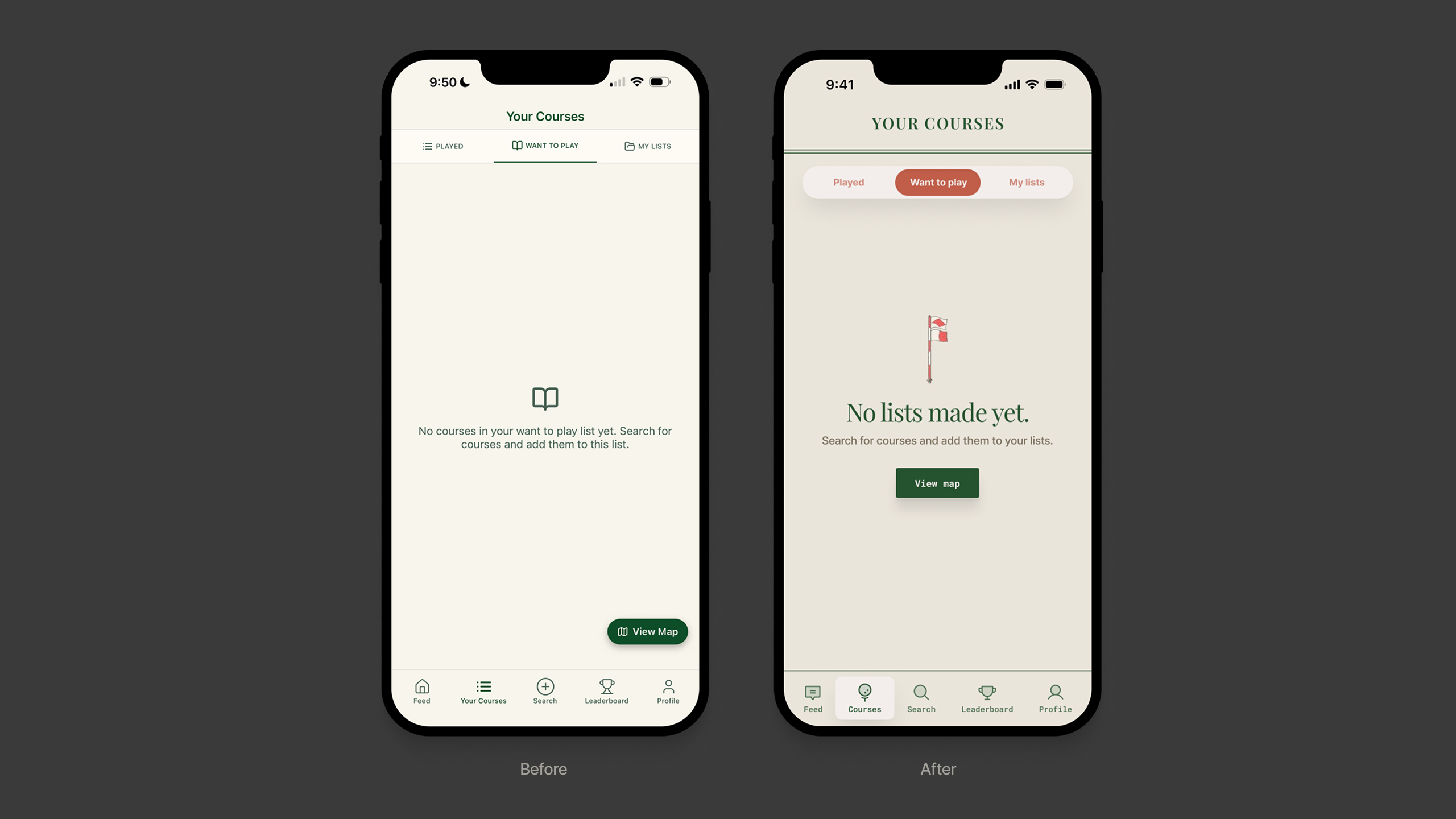
What changed
- Extended the pill toggle to three options (Played, Want to play, My lists), matching the global pattern
- Replaced the generic icon with an illustration drawn from classic golf imagery
- Shortened the empty-state copy and added a headline for clearer hierarchy
- Moved View Map from a corner floating button to a centered CTA in the empty state, a more natural next step
Buoy Health