SummerOS began as an internal tool for property acquisition, then became a SaaS analytics platform for short-term rental managers.
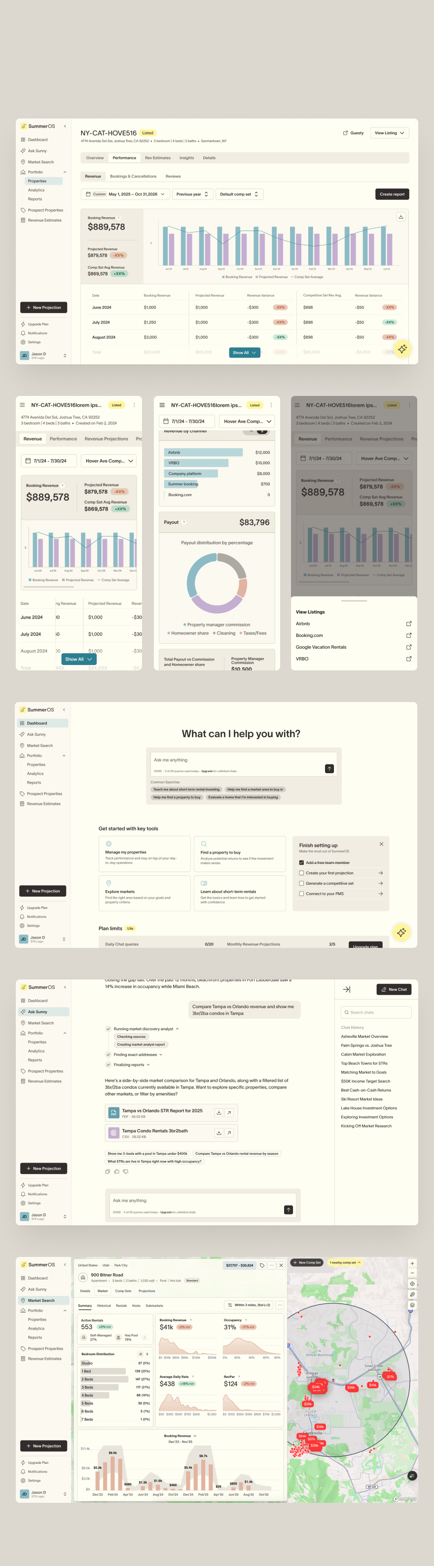
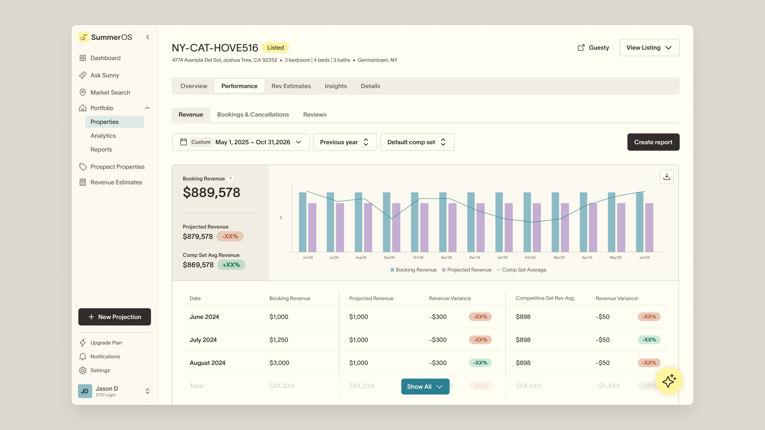
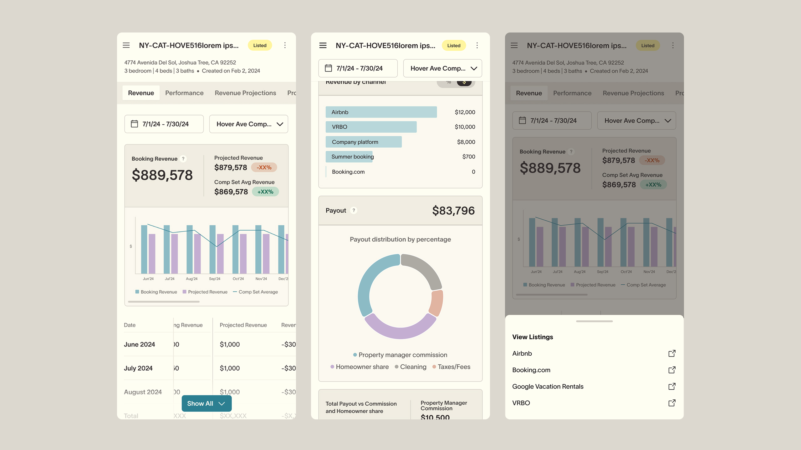
SummerOS gave short-term rental managers one view of the market: benchmarks, forecasts, and portfolio performance in a single AI-driven platform. It was built for managers watching and acting on performance across portfolios of any size.
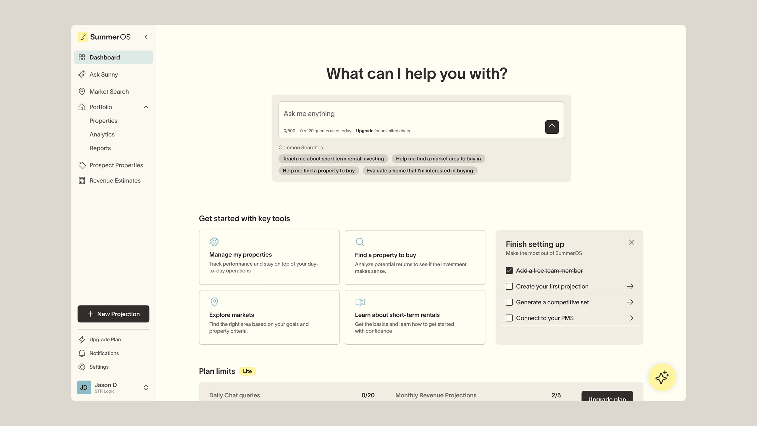
It replaced the spreadsheets the industry still ran on with professional-grade asset intelligence. A built-in AI assistant, Sunny, surfaced market signals and performance insights in real time, turning hours of manual research into decisions made in minutes.
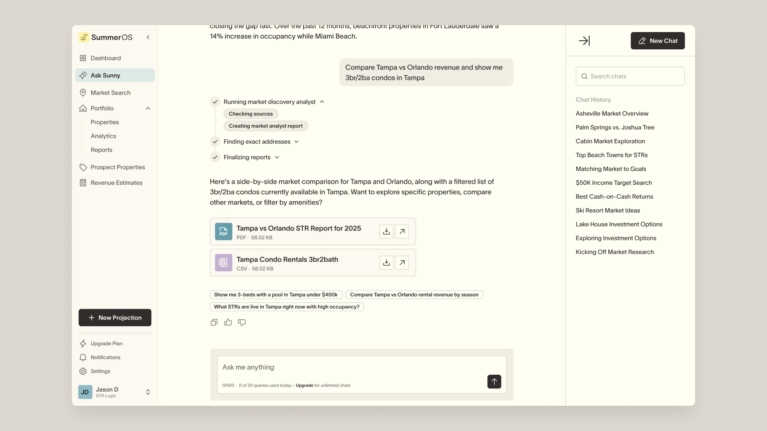
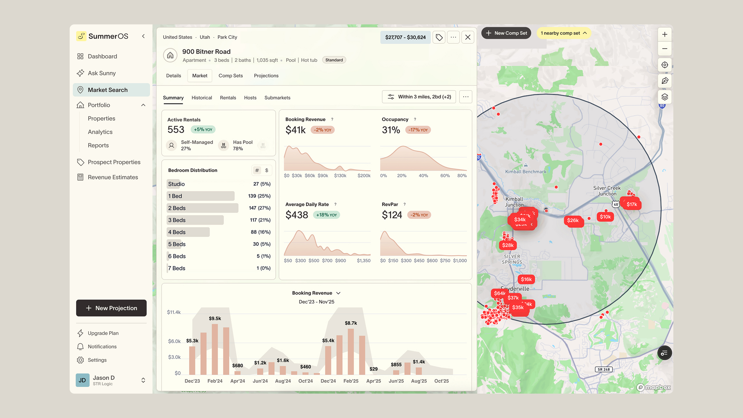
Rebuilding the projection flow
The problem
SummerOS had grown feature by feature as an internal tool, so by the time it became a customer-facing product, the navigation was no longer intuitive and several key workflows needed rethinking.
Building a revenue projection, one of the most important things a user could do in the product, meant guessing where to click, with critical steps like finding comparable homes in the dataset buried where no one would think to look.
Goals
The goal was to let first-time users finish a projection on their own, without hand-holding from our team. In demos and customer calls, people were getting lost mid-flow, losing confidence, and sometimes giving up before finishing. Success meant a faster, clearer flow that felt familiar to how operators already work, shortening the learning curve and driving higher adoption.
Key considerations
- Guide first-timers step by step, but let experienced users skip ahead or jump straight to the term sheet.
- Work for both managed homes (in-network) and prospect homes (potential buys), with the difference clear enough for engineering to scope and build correctly.
- Take inspiration from how operators already run projections, often by hand, rather than forcing a new model on them. Instead of copying their process one to one, I used it as a starting point to shape the order of the steps and streamline what we surfaced at each one.
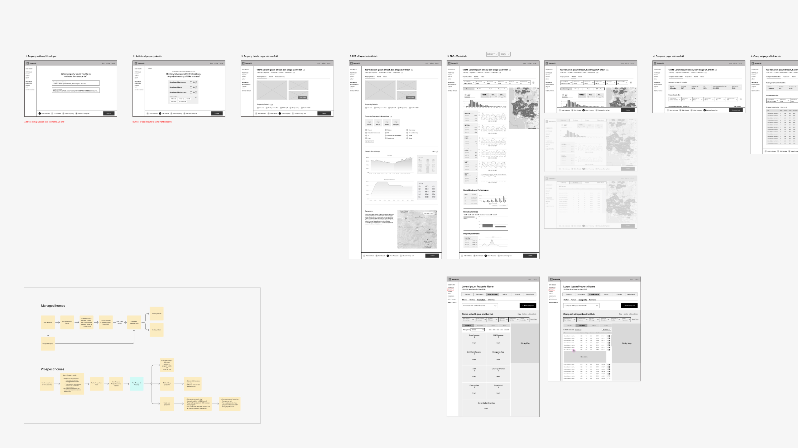
Research and discovery
To ground the flow in real workflows, I worked closely with our in-house expert, who had spent years vetting properties as short-term rental investments. How he actually made those calls shaped the order of the steps and what information mattered most at each one.
Design approach
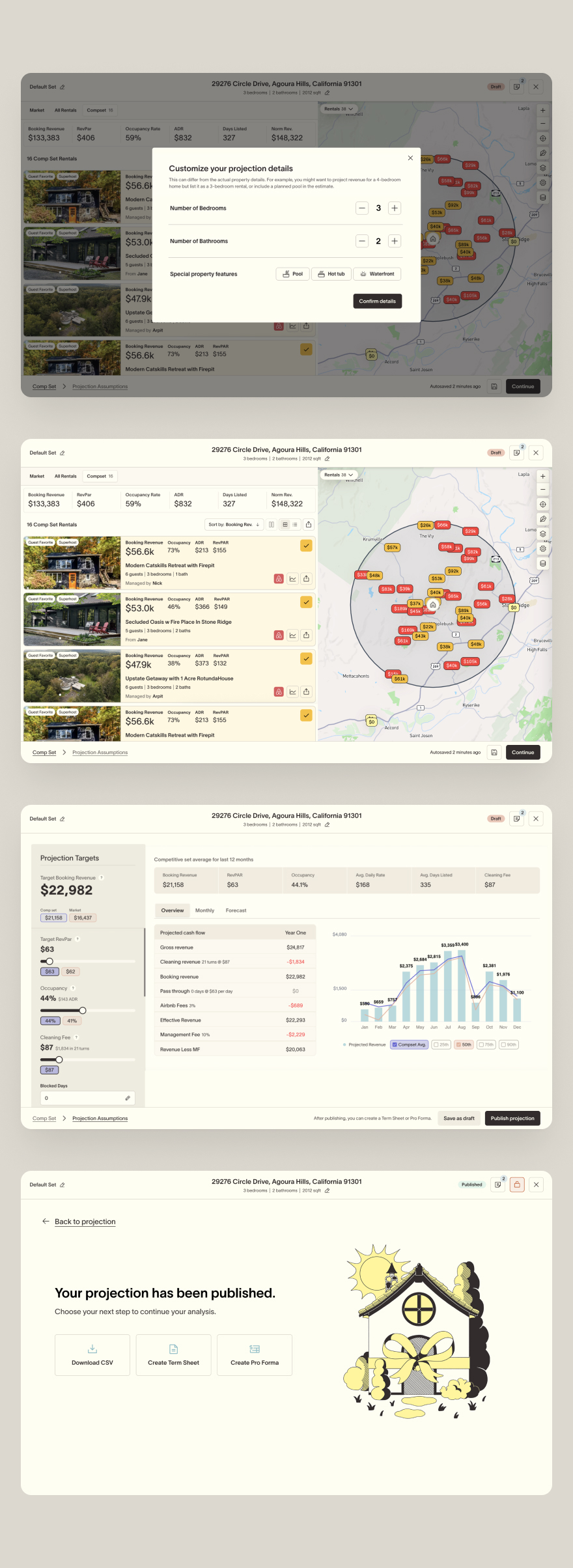
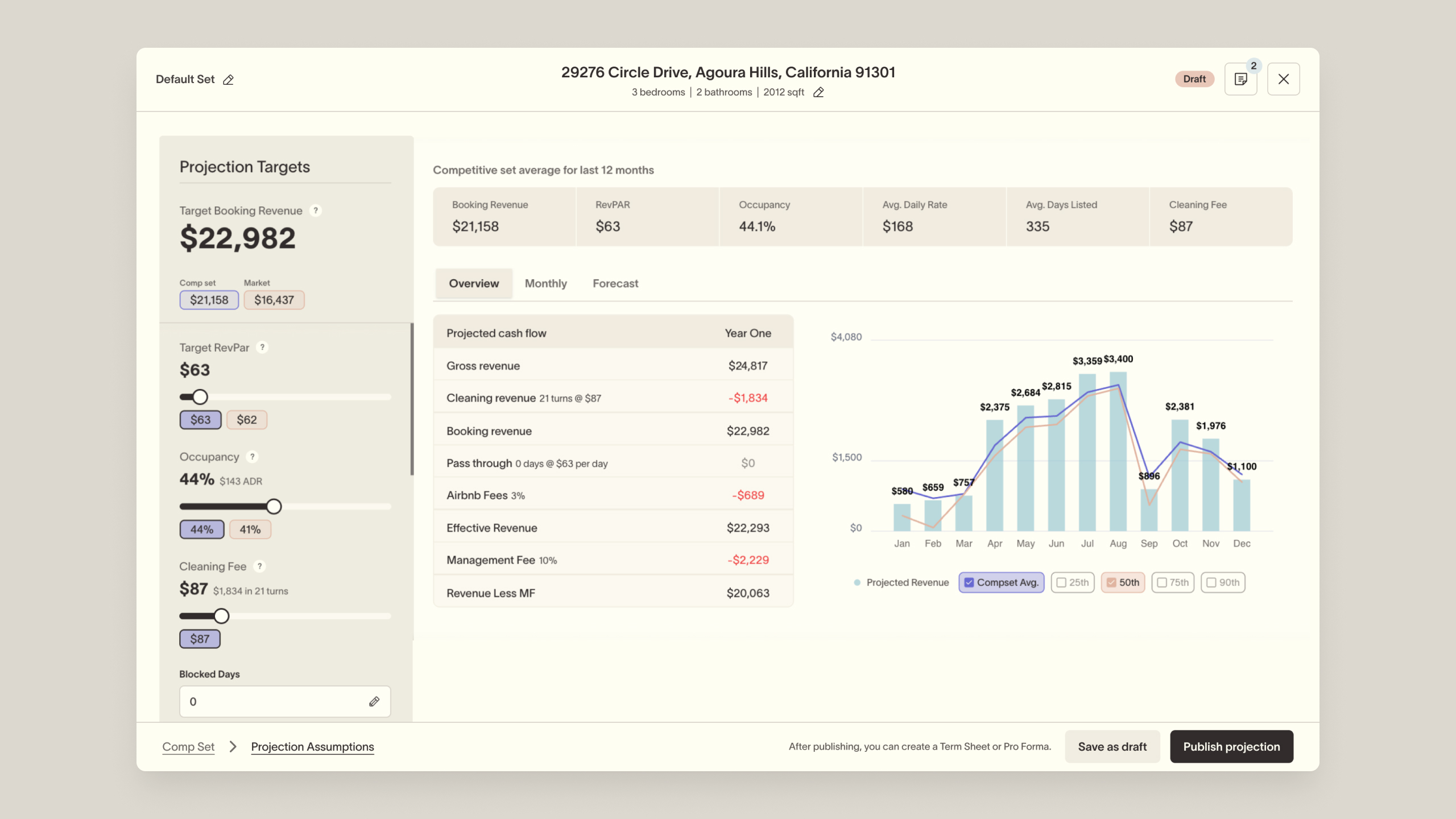
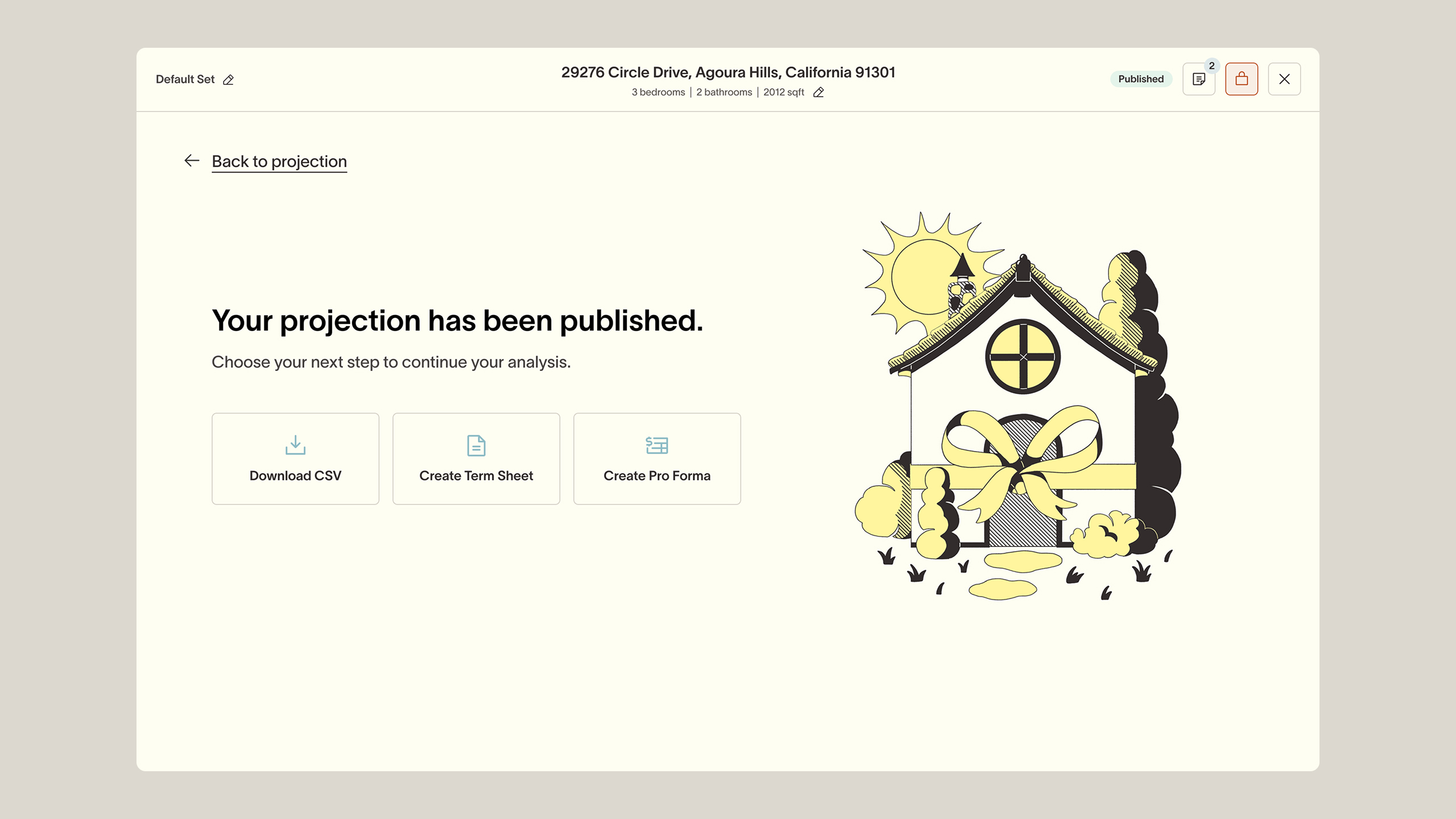
I replaced the buried navigation with a clear, linear flow where every step was visible and in order. Experienced users could still skip ahead or go straight to the term sheet without being walked through every screen.
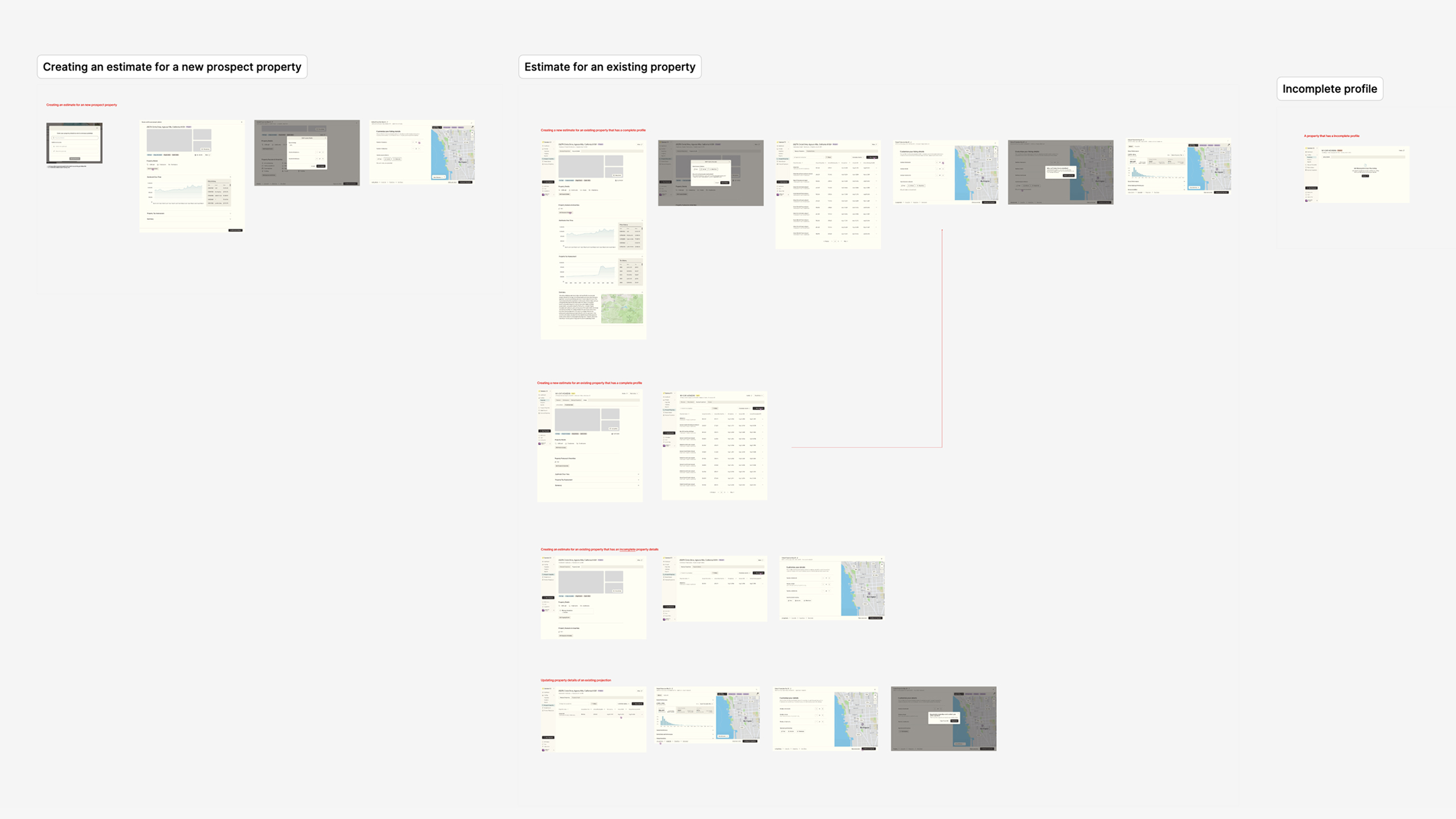
Key design decisions
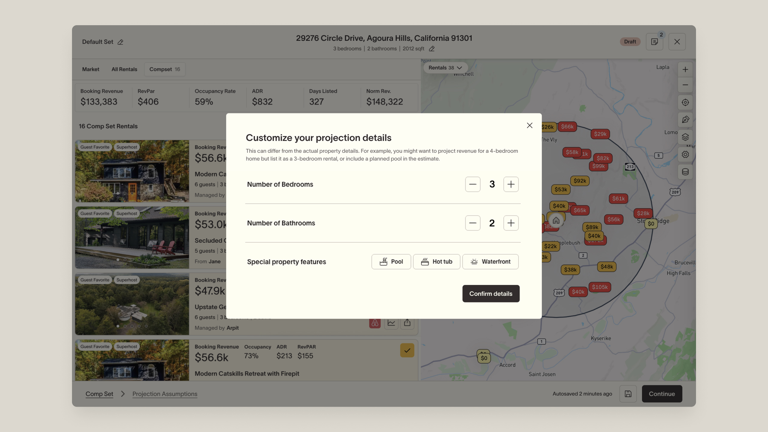
The biggest change came out of testing. The original first step was a property details screen (bed count, amenities, other home info) that appeared right after the user entered an address. It consistently felt disorienting: people expected to land in the projection, not on a screen of details they didn't need to touch.
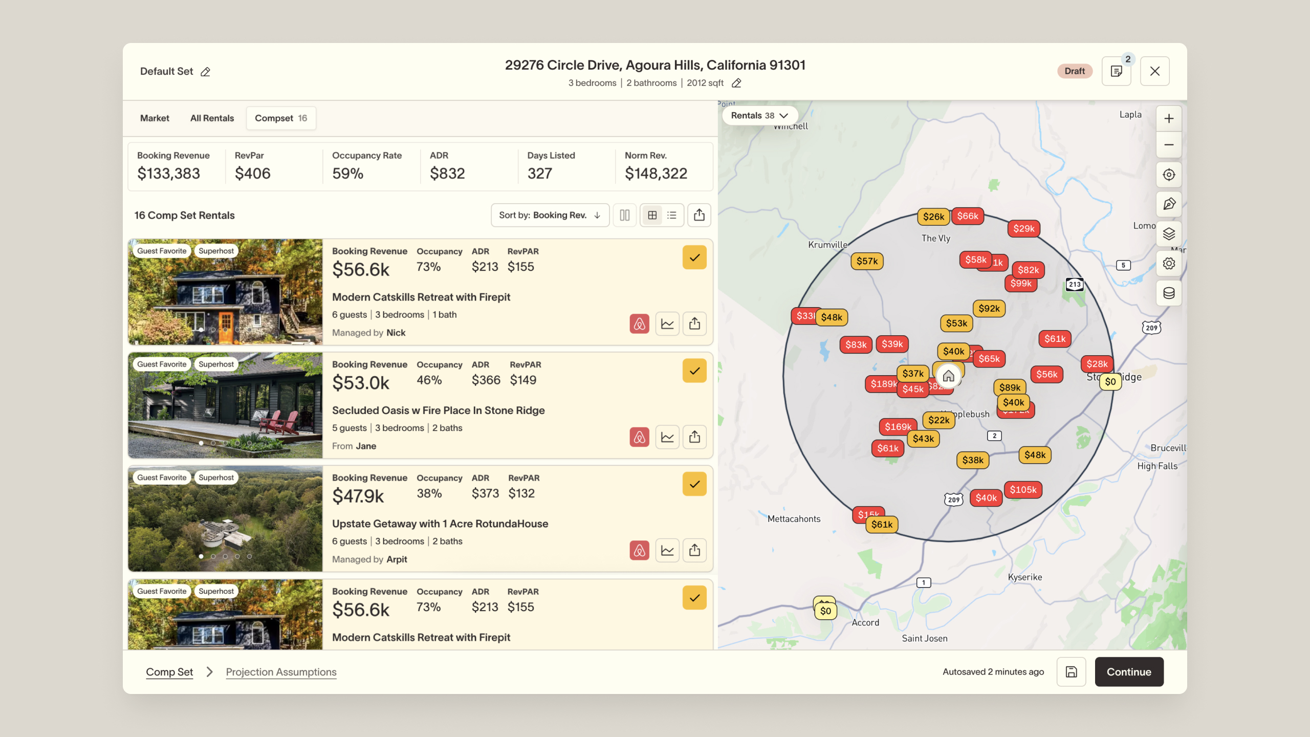
So I cut it as a step and moved those inputs into a modal on the comp set screen, which became the new first thing you see. The flow felt like it dropped you straight into the projection, and people engaged faster. Nothing important was lost: the modal stayed one click away from the navigation for anyone who needed it. It felt shorter without actually being shorter.
Impact
Support requests and hands-on demos dropped, a sign that people were getting through the flow on their own. The rework also cleared technical debt that had made the flow hard to build on, leaving it far easier to extend.
Eden